Case study
Building a new signup flow
Overview
Betterment is the largest independent online financial advisor. It has $16 billion in assets under management and over 400,000 customers across its three business lines. Betterment for Business (B4B) allows Employers to offer 401(k) plans to their employees and, as a result, allows them access to Betterment’s retirement dashboards and investment portfolios.
As part of our B4B Offering, we wanted to add a new kind of savings called a Health Savings Account (HSA). Our team was tasked to build the sign-up for this new savings account.
My role
My role was to understand how to guide users through the process of choosing the right type of Health Savings Account and how we should educate users in a friendly yet compliant way. I worked with product managers, the compliance team, our HSA Banking Partners, and engineering.
The Project
MVP and Product scoping
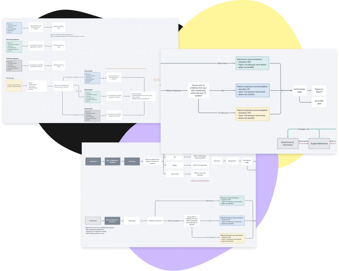
Service Blueprints
User journey mapping
Wireframing and cross-team collaboration
Prototyping and internal tooling
Pairing with engineering
The Problem.
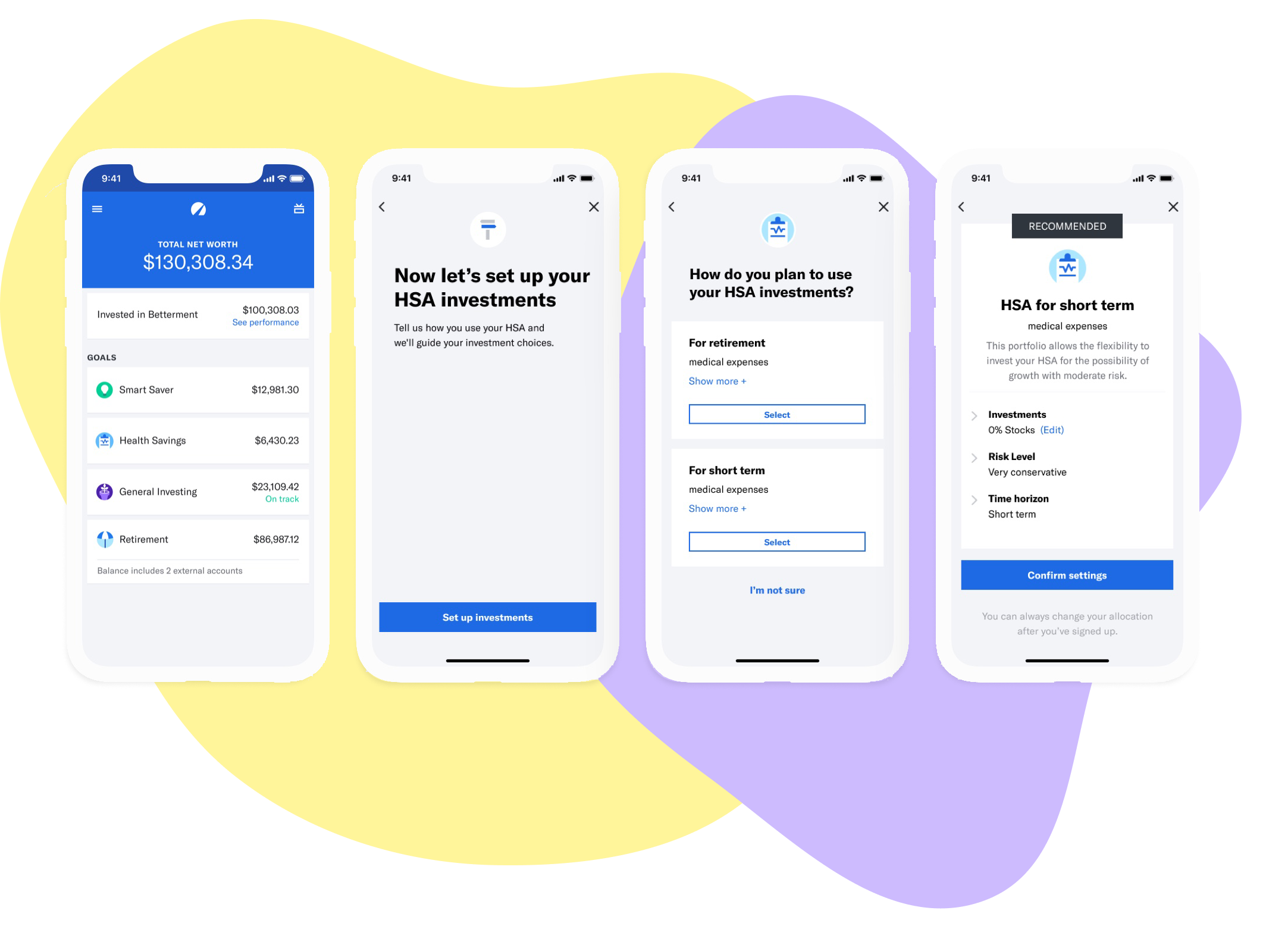
A Health Savings Account (HSA) is a different type of savings that lets you set aside money on a pre-tax basis for qualified medical expenses. There are two ways a person can use their HSA. For short-term expenses or for long-term investment. It’s important for users to know which type of account they plan to use as it impacts how they will be taxed when they withdraw money. Since many users don’t have this kind of account, we needed the sign-up to be educational and compliant.
How might we give our users a seamless and comfortable experience so they feel confident that they’re making the right investment choice?
Goals.
The team agreed our success criteria for the project should be both qualitative and quantitative.
Keep it simple (relatable)
Keep it easy (confident)
Set expectations early and often (reassured)
Conversions (completed sign up & funded accounts)
Compliance research & whiteboarding.
I met with the compliance team and the subject matter experts to understand what we needed to ask our users in order to guide them to the right account setup. We worked together to chart out the order of questions and the ways we could recommend setting up their account to fulfill their needs.
Design research.
Then, I took a look at different kinds of signup flows and onboarding experiences to understand different ways to educate users.

Usability testing.
I worked with my team to align on the questions we wanted to ask our users. I then drafted a discussion guide to help us answer if our users felt confident and comfortable in their investment choice after they went through our sign up flow. I then set up an unmoderated test through usertesting.com where I analyzed the results and made iterations based on the feedback.
What we wanted to test.
Do users understand their HSA Account options?
Are these questions in the right order or does it further confuse the user?
Do users understand what they’ve signed up for?
Short term (for immediate expenses) vs. emergencies vs. long term (for retirement)?
Where should users go after they’re done signing up?
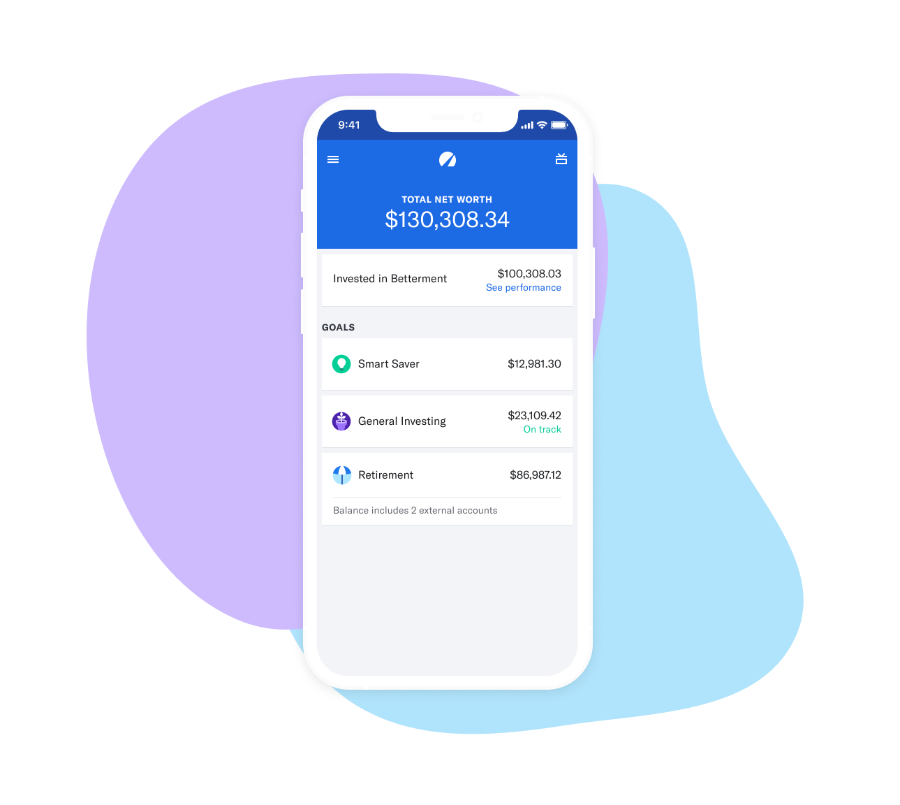
Back where they started, on the account goal, on the home dashboard?
Usability test results.
-
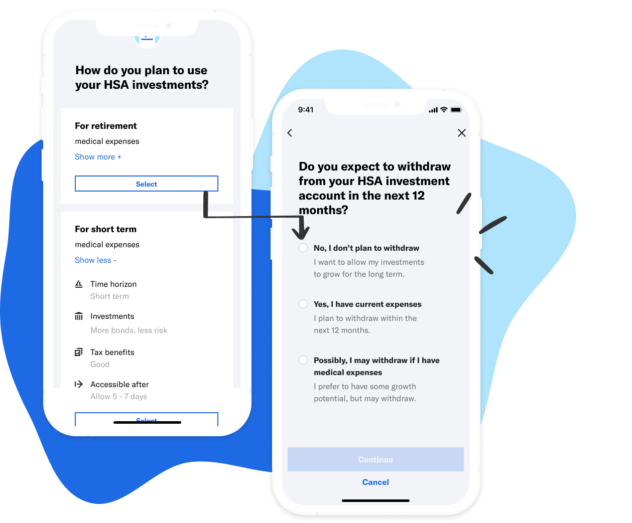
Do users understand their HSA Account options?
Yes! 👍7/7 Users understood they had two options (long term/more stocks vs. short term/more bonds).
We found following up with a timeframe to check their answer also reinforces their decision.
-
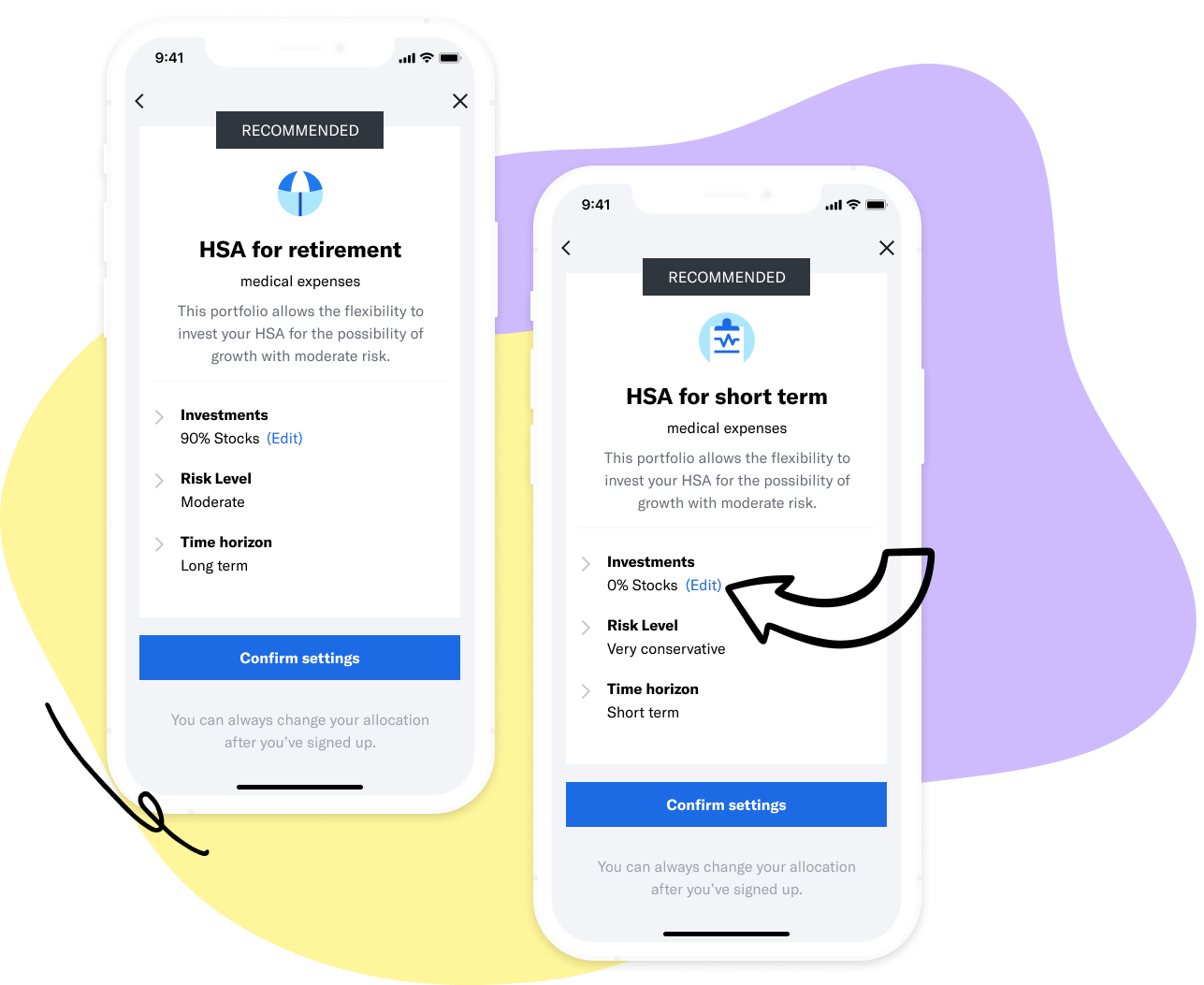
Do users understand what they’ve signed up for?
Yes! 👍7/7 Users felt delighted to get a “recommended” investment type.
The edit button near the allocation made them feel comfortable and in control. They didn’t feel locked in.
-

Where should users go after they're done signing up?
Bank? 3/7 would go back to the bank to transfer funds into their account.
Exit page? 3/7 would just leave. There’s nothing immediate thing they can do.
Dashboard? 👍 7/7 didn’t expect it but didn’t mind it.