Case study
Optimizing the checkout to reassure users of their purchase
Overview.
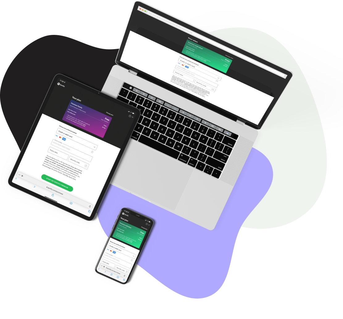
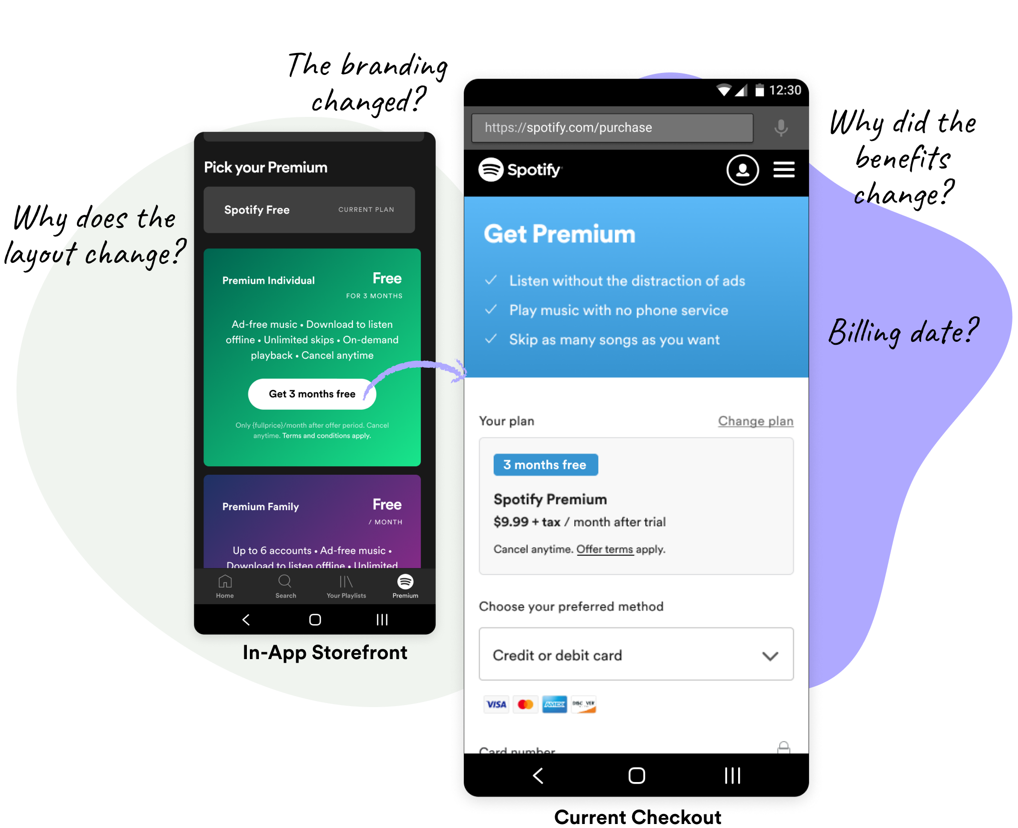
At Spotify, when users upgrade from the Free tier to the Premium tier, we link them from our in-app storefront to a web checkout. Many teams have touched the checkout for their users, yet we haven’t made a concerted effort to maintain consistency from the in-app storefront to the web checkout. As a result, when users click-through to purchase they experience inconsistencies around colors, trial information, and even product info.
We believed a more consistent UI with trial information throughout checkout will make users feel more secure and reassured about their purchase and reduce uncertainty in giving us their payment.
My role
My role was to conduct workshops to align the team on the opportunity and user needs. I delivered design solutions and helped prioritize the experimentation roadmap.
The team
1 Product Manager
1 Front End Engineer
1 Data Scientist
2 Data Analysts
The checkout happy path
-

Step 1: Look at the plans
“I know where I can buy”
-

Step 2: View item details
“I know what I'm buying”
-

Step 3: Purchase summary
“I'm ready to check out”
-

Step 4: Payment & billing
“I'm ready to pay”
-

Step 5: Purchase confirmation
“I've paid”
The Problem.
In our internal user research, we saw the inconsistent content around the product offering from mobile to web checkout was jarring and confusing for our users. Additionally, in our experiments, we saw an increase in conversion when we added more transparency around trials, such as billing dates, cancellation instructions, etc.
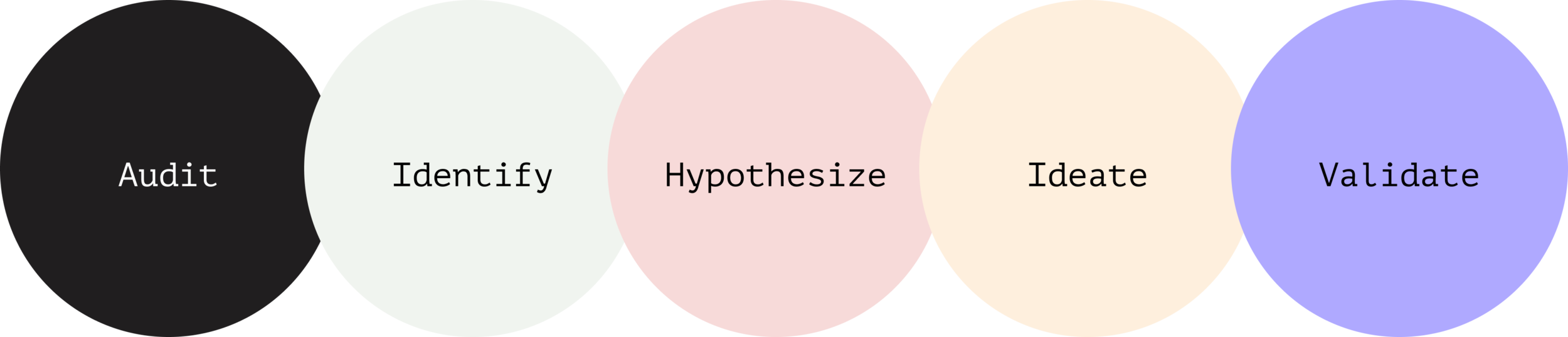
The Process.
I helped facilitate a series of workshops to help us understand which part of the purchasing flow we should optimize and how we might validate these hypotheses.
-
I leveraged existing insights and completed an extensive audit of our competitors to help define our current landscape.
-
After I facilitated a deep dive workshop, we generated How Might We statements and identified opportunities.
-
I facilitated a workshop to help us generate hypotheses based on our research. We discussed what changes to the purchasing flow could drive the most behavioral change.
-
After determining our hypotheses, I generated ideas that could help validate our assumptions.
-
We ran a series of experiments that helped us identify specific changes that drove an increase in conversion and released a new evergreen checkout page.
Internal and competitive audit.
We looked at the purchase flow across a variety of e-commerce checkouts and saw a common theme of reassurance and consistency throughout the flow. We rated the products based on these criteria:
Perceived speed of checkout
Ease of purchase
Feels safe & secure
Overall UX

Opportunities.
When we looked at our user research, we saw that users eligible for a trial needed the most reassurance during their purchasing moment. Additionally, when we opportunity-sized our user segments, we saw the most upside to optimizing the checkout for those users.
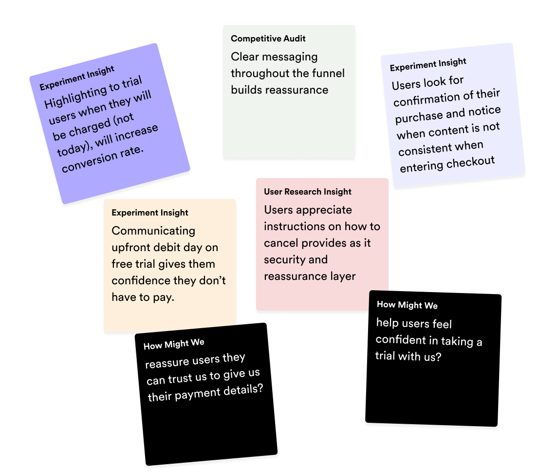
How might we reassure trial-eligible users when they checkout?
Help users feel confident they choose the right plan option (guide and summarize)
Help users feel secure they can give us their payment details (consistent UI, speed)
Help users feel in control of their Premium trial (trial and cancellation details)
Hypothesis.
We believe if we provide a consistent and transparent checkout, users will feel reassured that they are in control of their Premium trial experience. We will know this is true if we see an increase in conversion and retention.
Ideate.
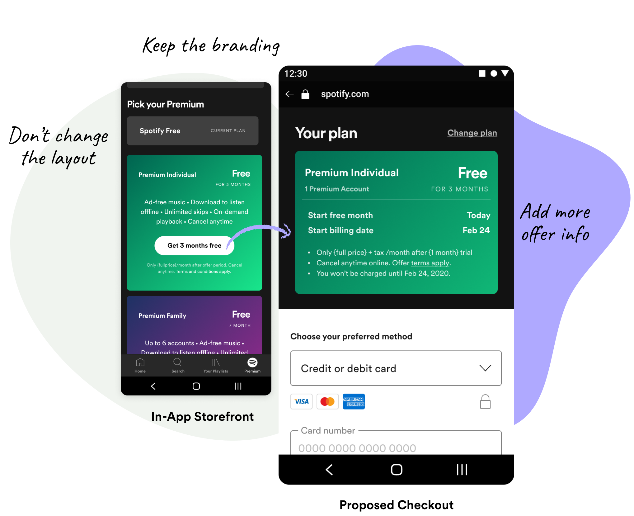
After reviewing the options we had to create a new check out we decided to focus on the moment when a user is reviewing their purchase, which was on the checkout page. We knew things like branding and consistency mattered. The other parts we wanted to test were What you pay today, What you get, and What your benefits are. So we decided to run an A/B test on the placement of those crucial pieces of information.
What we launched.
-

Control: Current experience.
We ran this experiment with the existing checkout to compare the changes.
-

Variant 1: What you pay today.
Putting the offer or the amount you pay at the top and bolded. Secondary information is reassurance on billing and cancellations.
-

Variant 2: What you get.
Only emphasizing the product. Putting the offer and the amount you pay as secondary information to the product you’re getting.
-

Variant 3: What your benefits are.
Similar to Variant 2, but adding the list of benefits below.
Results.
All variants are better, but Variant 1 and 2 had the highest conversion rate at 6% respectively during our campaign period.
We ran subsequent experiments breaking down the impact of each change. Resulting in a higher conversion rate across mobile and web. This led to the launch of a new evergreen checkout experience.

Epilogue.
In post-analysis, we saw an increase in conversion for different segments, so we launched a combination of the winning variants resulting in an overall 43% higher uplift compared to rolling out a single design to all users.
We also platformized the card so anyone can choose between layouts, content, and branding for their checkout.